Creating the main layout (quick start part 1)
Welcome to our quick start tutorial. In this tutorial you will learn how to build an application from scratch with JitBlox, without using a project template or predefined UI blocks. You will learn how to quickly set up the basic structure of an app, create custom components, implement navigation and connect your UI to mock data.
The tutorial is divided into three parts:
- Creating the application layout (this part)
- Navigating between pages
- Connecting the UI to data
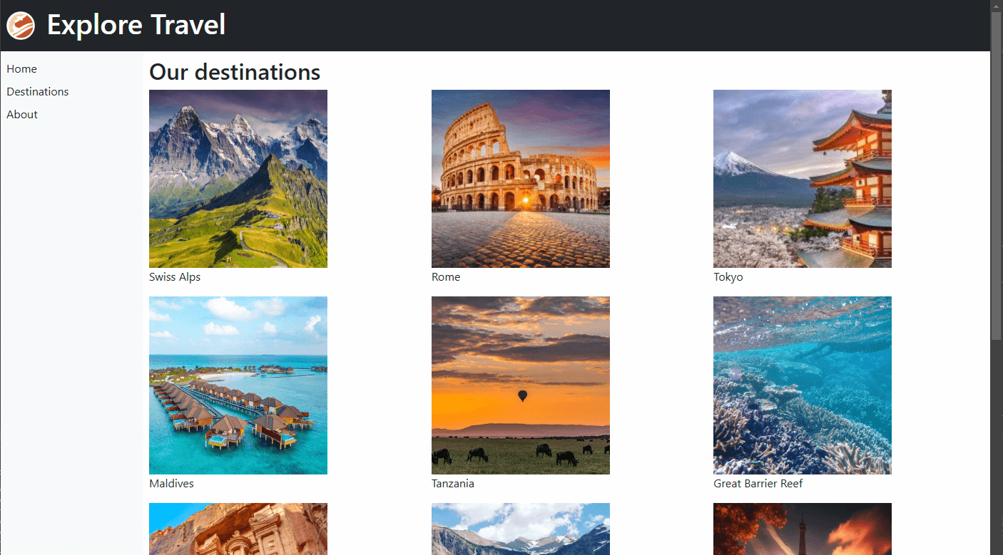
The end result will be a simple travel app, with a header, footer, working side navigation and an image grid containing travel destinations. The end result after completing the 3 parts will look something like this.
The tutorial uses Bootstrap. However, all techniques are directly applicable to any other UI library.
In this first part, you'll learn how to quickly set up the basic structure of your app, create a custom component, and use CSS utilities and a bit of custom CSS to quickly style your app.
Creating the new app
Make sure you are logged in so you can save your results to your account. Then, head over to the Create a new app page, make sure that Bootstrap is selected on the left, choose "Blank Bootstrap app" and click "Create". Next, enter a project name of your choice. Now you have an empty starting point for our tutorial, let's get started!
Setting up the main layout
We start by creating the main layout using a CSS grid. For this, we will choose one of the predefined layouts in JitBlox. Before doing this step, make sure you have Main Layout (the root component), open in the designer.
- Open the toolbox using the Insert (+) command - use the context menu or button above the designer.
- Go to the Layout category, find the CSS grid with header, footer and sidebars and click Configure.
- Find the Right sidebar option and disable it (we only need a sidebar on the left).
- For the Left sidebar width, enter a value of
200px.

Inserting a CSS grid - For now, leave all default contents as is and click Insert.
Adding basic styling
As you can see in the preview, the layout is still very unclear at the moment. Before we replace the placeholders with usable content, let's add some color and space using Bootstrap utilities.
- Select the Header element and hit the "q" key to focus the quick styling search input.
- Find the Colors utility category (click to list all).
- Pin the Add Colors utilities panel so that we don't need to search for it again for the other sections.
- Click the Text/background color utility to apply it and select "dark" from the list of available options.
- Repeat the previous for the Footer element.
- And finally, give the Left panel a Background color with the value
body-tertiary.
We have now made our layout a lot clearer by setting background colors (you can close the Add Colors utilities panel now). In the same way, we can now add some padding to each section:
- Select the Header element again.
- Locate the Spacing utility category in the quick styling pane and pin it.
- Click the Padding utility to apply it and select a value of your choice (a padding of 2 will look good).
- Repeat the previous step for the Left, Main and Footer sections.
Implementing the header
That's it for the main layout. Now let's start filling in the different sections, starting with a company logo and title in the header.
- First let's get rid of the "Header" placeholder text: right-click the header element and choose Clear Text.
- Then, with the empty header element selected, hit the "+" key.
- Find the Image widget (tip: enter "img" as search term) and click Configure.
- Set the image source to the following URL:
https://media.jitblox.com/docs/quick-start/quick-start-logo.png - Set both image width and height to
40and click Insert.
And then to add the title:
- With the image element still selected, choose Insert Below (b).
- Search for "h1" and click Configure.
- Enter a name for your travel company (or use a travel company name generator) and click Insert.
As you can see, the alignment of the logo and the title isn't quite right yet, so let's fix that now we're at it.
- With the header element selected, locate and pin the Flex utility category.
- Add the Enable flexbox utility to give the element a flex layout.
- Add the Align items utility with the value "center" and close the Flex utility group.
- Finally, search for the "column gap" utility in the search box to add some spacing between the logo and the name. A column gap of 3 will look well.
You have now covered the most important aspects of creating a layout: working with the designer, the toolbox and utilities. We'll leave the footer up to your own creativity and leave the main content as is until the next part of the tutorial. However, we will make a start with the side navigation.
Creating the initial navigation component
For the navigation component, we're going to use a native HTML list element (ul) and add some styling to it.
- Get rid of the "Left" placeholder: right-click the header element and choose Clear Text.
- Then, hit the "+" key with the empty header element selected and enter "ul" to search for the List (ordered/unordered) widget.
- Click Insert to accept all defaults - we happen to need 3 navigation items.
- Select the first list item and hit the "t" key to edit its text.
- Replace "List item 1" with "Home" and confirm.
- Similarly, replace list items 2 and 3 with the texts "Destinations" and "About" respectively.
Before we start styling our side navigation in the making, let's first organize our template a bit by making the side navigation a separate component. You will see later why this is useful.
- Right-click the
ulelement that you added in the previous step and choose Convert To Component. - Enter "SideNav" for the component name and confirm.
You will see that the new SideNav component has been created and a placeholder appears in the template preview. To see a preview of the full app, click the Live Preview button at the top right of the designer.
Now open the new SideNav component so that we can add some styling.
- With the
ulelement selected, search for the Unstyled list utility and add it. - Then open the Custom CSS editor and add the following CSS rule:
li {
    padding: 0.25rem 0;
}
Why not use a more specific CSS selector? The custom CSS above will not affect any other li elements in your app, because all CSS in the component editor is scoped to the current component. A more complex selector is therefore not necessary.
Next: implementing navigation
That concludes the first part of the quick start tutorial, where you learned how to quickly set up the basic structure of an app, create a custom component, and use CSS utilities and custom CSS to quickly style your app. If you wish, you can now easily download the source code of your app and run it on your own computer. Can't figure it out? Check out this page for instructions.
In part two of the quick start, we'll put the side navigation to work.