Navigating between pages (quick start part 2)
This is the second part of our three-part quick start tutorial. If you have completed the first part then you have now created a base application layout and a side navigation component that is not yet operational. If you skipped the first part, no problem: open this project and click Save As to have a starting point for this part.
For your reference, the quick start tutorial consists of the following parts:
- Creating the application layout
- Navigating between pages (this part)
- Connecting the UI to data
In this part you will learn how to implement navigation between different pages. We will do this by putting the side navigation from the previous section to work, using routing.
Adding some pages
Since we don't have any pages to navigate to yet, we're going to add them to our app first. In component-based web apps, a page is basically nothing more than a regular custom component, so let's create three new components with some simple content.
- Right-click on the My Components panel in the Project Explorer and choose New Folder.
- Enter 'Pages' as the folder name and confirm.
- Right-click on the new Pages folder and choose New Component.
- Enter 'Home' as the component name and confirm.
- Repeat the steps 3 and 4 for the 'Destinations' and 'About' pages.
As a final step, add some content to each page so you recognize it when you navigate to it in a moment. For example, add a simple HTML heading with the name of the page.
Displaying the active page
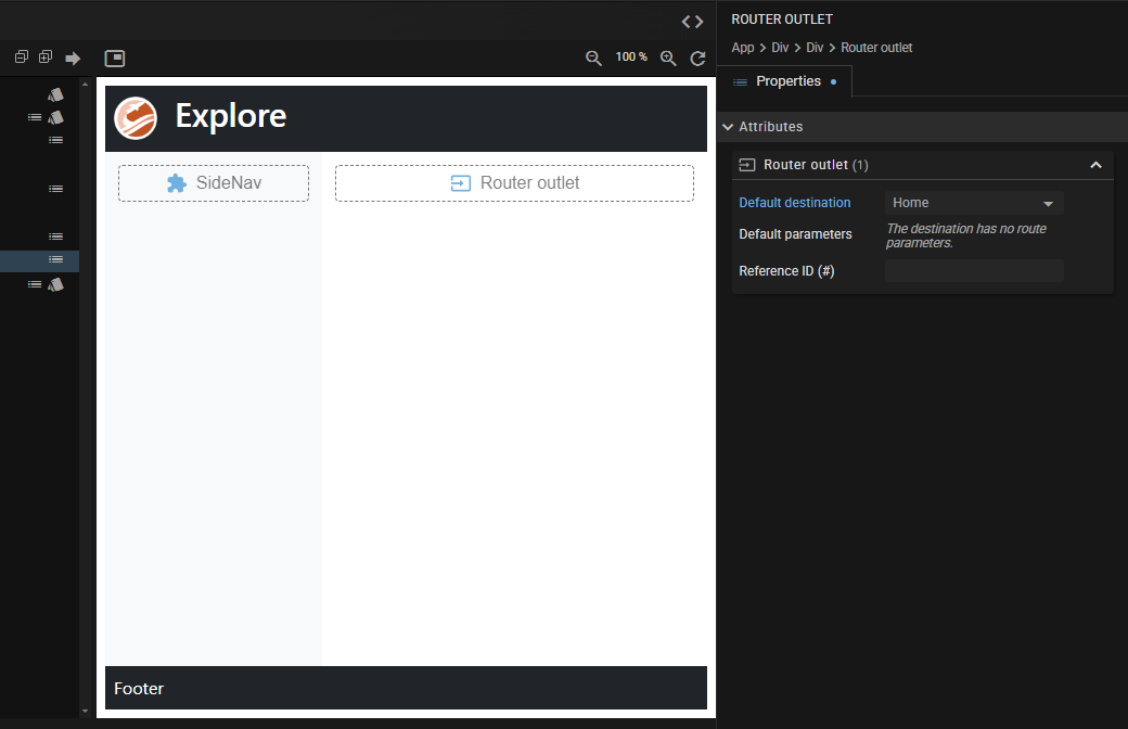
We are now going to enhance our app so that the content of the active page is displayed in the main section. For this purpose we need add a Router Outlet to the App (root) component.
- Select the element with de placeholder text "This is the main content", right-click and choose Clear Text.
- Then, with the empty main element selected, hit the "+" key.
- Locate the Router Outlet widget in the Navigation category and click Insert.
Right now you won't see any difference when viewing the full app in the Live Preview, but even without working navigation we can change this and show the home page by default:
- Make sure you have selected the Router Outlet you just added.
- In the details editor, change the Default destination from empty to
Home.
Now take a look at the full app and notice that the home page content appears automatically without having to navigate to it.
Getting working navigation links
Finally, of course, we want working navigation links. We laid the foundation for a side navigation menu in the first part of this tutorial. Now we are going to make sure that each menu item opens the corresponding page.
- Open the SideNav component and select the list item containing the text "Home".
- Right-click and choose Enclose Text In... (not to be confused with the regular Enclose In).
- Locate the Router link widget in the Navigation category and click Configure.
- Select the
Homecomponent as the Destination. - Repeat steps 1-4 for the
DestinationsandAboutpages.
Check out the full app now and see your side navigation in action!
As you may have noticed in the Live Preview, JitBlox automatically creates route URLs based on the name of the destination component. If you want to adjust the last part of the URL, please refer to the routing docs.
Just a little bit more styling.
I know what you're thinking: the navigation links now have a standard hyperlink style and don't blend well with the rest of the app yet. Let's quickly fix this with some custom CSS. Open the component's Custom CSS editor and add the following CSS rule:
a {
  text-decoration: none;
  color: var(--bs-body-color);
}
Next: creating a data-bound image grid
That concludes the second part of the quick start tutorial, where you've learned how to implement routing and navigation. In part three we will populate the "Destinations" page with a data-bound image grid of travel destinations.