Supercharge your design workflow with Shoelace and Tailwind CSS in JitBlox

Today I'm excited to announce that JitBlox now supports a new combination of UI libraries to design your web apps with: Shoelace and Tailwind CSS. Shoelace is a modern library of web components, and Tailwind CSS is a utility-first CSS framework: it provides utility classes that can be composed to build any design without having to write CSS. Both libraries have experienced significant growth in popularity in recent years. Combined with the power of JitBlox's visual designer they provide an unparalleled real-time prototyping experience, even if you have no design skills.
If you're not familiar with JitBlox, it's an online environment that accelerates the design and prototyping of modern component-based web applications. JitBlox lets you generate working prototypes interactively and without coding, giving you a jump-start on your next web project.
In the first section of this post, I'll cover how JitBlox makes working with Shoelace, and web components in general, easier. In the second section, you'll see how our quick styling feature helps you discover and apply the countless Tailwind CSS utilities and variations without getting lost.
Working with (Shoelace) web components in JitBlox
Web components are becoming increasingly popular, so integration of web component libraries has been on the JitBlox roadmap for some time, with Shoelace at the top of the list.
Web components are a native browser technology that provides a standard way to build reusable, encapsulated UI components without relying on any framework. While the adoption curve has been slow compared to popular frameworks like React, Angular, or Vue, web components are gaining traction for several reasons: they work with all frameworks (allowing them to be shared across multiple projects that use different technologies) and the ecosystem and tooling around them are growing.
Shoelace offers more than 50 framework-independent web components - which is an impressive number compared to Bootstrap or Material Design. It includes a dark theme and comes with Bootstrap icons by default. The library is being actively maintained, and the next iteration, Web Awesome, is planned for April 2025. You'll find every Shoelace component in the JitBlox toolbox, where you can configure key features right away in real-time. Here is an example of how to quickly configure and add a Shoelace Alert to your design:
There are several - sometimes challenging - aspects that developers and designers face when using Web components: slots, CSS custom properties and CSS parts. With this release, we have also taken the opportunity to make working with these easier.
Dealing with component slots
A slot is a placeholder inside a web component where you can insert custom content. The most common slot is the default slot, which includes any content
inside the component that doesn’t have a slot attribute. Some components also have named slots. A named slot can be populated by adding a child element with the appropriate slot attribute.
Figuring out which slots a component has available normally requires you to go through the component's documentation, but JitBlox eliminates this step and lets you automatically choose
from the available slots when you add new content to (or drop into) a component. The following example demonstrates how slot selection works when inserting an HTML heading (H3)
into a Shoelace Card and assigning it to the "header" slot.
CSS Custom properties
Shoelace makes extensive use of CSS custom properties (often called CSS variables). They use CSS variables for high-level design tokens and component-specific customization.
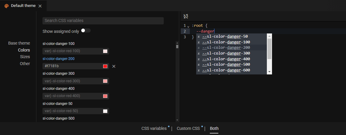
Create your own theme by overriding design tokens
Design tokens provide a high-level way to build your own theme by - for example - overriding default color values. The fastest way to discover and override a token is using our integrated theme editor, which lists all CSS variables that are available. However, if you need more control, you can also customize them using custom CSS, with now improved code completion:

Component-specific custom properties
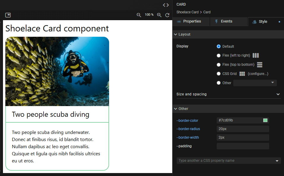
For convenience, some Shoelace components expose CSS custom properties you can override. You will not find these properties in the theme editor (and they are, unlike design tokens, not prefixed with "sl-"). You will, however, find these properties in the style properties of a component, where you can override them as well:

You can also modify these properties with custom CSS, of course. In that case, the style editor is still a handy place to see which ones are available.
Usually, you will write custom CSS globally (in the theme editor), but if you want to modify CSS variables only within the scope of a custom component, use the “Custom CSS” tab in the component editor instead.
CSS parts
Whereas design tokens offer a high-level way to customize the library, CSS parts (see the CSS standard) offer a low-level way to customize individual components.
CSS parts solve a common challenge with third-party web components: it is often hard for developers to customize their appearance because the internal structure is hidden and protected from external styles. The solution: the component author can
expose specific internal elements for external styling by marking them with the part attribute.
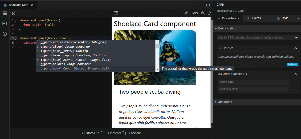
JitBlox supports CSS parts using code completion in its custom CSS editor. Here, we've added a custom .demo-card class to the previous Card example so that we can
customize the Card's body.

Quick styling with Tailwind CSS
By default, Shoelace components do not include basic styles or CSS utilities for aspects such as layout or typography. This is a deliberate design decision aimed at providing developers with flexibility to incorporate Shoelace components into their projects without conflicts or additional dependencies. Tailwind CSS, a utility-first library with classes that can be composed to build any design, is perfectly suited to fill this role.
CSS utilities (or utility classes) are small, reusable classes that apply specific, single-purpose styling rules to elements. They allow developers to style elements quickly and consistently without writing custom CSS for each component.
JitBlox, as a rapid prototyping tool, has always encouraged a utility-first approach using the quick styling panel. To make quick styling with Tailwind - known for its large number of utilities and a nearly endless number of possible combinations - even easier, we've made some improvements to the user experience. You now have a choice of two ways to add a utility to an element:
Discovering utilities by category
This method functions as an integrated utility reference, which lists all utilities by category: helpful if you don't know the name of a utility, or if you just want to know what utilities are at your disposal:
Note that once you select a utility from a list, the list automatically gets out of the way. If you want a list to stick, you can use the small pin icon above the list. This is useful if you want to quickly add the same utility to other elements as well.
Find by name
A quicker way to add a utility, if you already know which one you need, is to search for it directly:
Last but not least: responsive design using modifiers
How do you apply a utility only when, say, your app is viewed on a small screen? For that purpose, Tailwind has the concept of modifiers. Modifiers are special prefixes or suffixes added to utility classes to alter their behavior based on specific states, screen sizes, or conditions. These modifiers are powerful tools that help you apply styles conditionally, such as when a component is hovered, focused, or viewed on a specific device. We've also made it extremely easy to find and enable modifiers. Let's enhance the background color utility from the previous example to only apply on screens wider than the "sm" breakpoint (640px):
Current limitations
March 2025 update: the limitation below no longer applies since the integration of Tailwind 4 in our theme editor!As an experienced Tailwind user, you might be wondering how to create your own Tailwind configuration in JitBlox (a JavaScript configuration file to customize the framework - e.g. build a custom theme). We deliberately chose not to include support for this. The reason: Tailwind 4. This next major version of Tailwind is expected early this year, with - as they put it - an updated developer experience where you customize and extend the framework directly in CSS rather than in a JavaScript configuration file. So, stay tuned for updates on Tailwind theming with JitBlox!
You will also see that there are no project templates for the Shoelace/Tailwind option yet. Here we still have some work to do. If you would like to contribute (or know some) example templates, please let us know!
Other recent changes
Angular 19
Last November, the Angular team released Angular 19. Starting today, JitBlox also supports Angular 19 as a target, which is the default for our new Shoelace with Tailwind option. Our Bootstrap and Material Design options will be extended shortly.
Write component-level CSS
As touched upon earlier in this post, it is now possible - in addition to at the global level - to write custom CSS at the component level.
Simplified Bootstrap and Tachyons utilities
Users already accustomed to using CSS utilities in JitBlox will notice that their Bootstrap or Tachyon utilities are displayed more compactly, rather than by category. Also, any responsive utilities like the Bootstrap "Flex (≥ lg)" have been upgraded to their regular counterpart combined with a breakpoint modifier, in line with how this is implemented for Tailwind.
Join the conversation
We encourage you to share your feedback with us, good or bad, by submitting issues or leaving a comment on this post. This will help us improve JitBlox and fine-tune our roadmap, so please let us know what you think.
Read next
Building in-app navigation with JitBlox has become easier: file-based routing explained
Learn how building in-app navigation with JitBlox has evolved, including predictable paths, nested navigation, and path overrides — no code required.
Angular 21, smarter AI, and what's next for JitBlox
JitBlox now supports Angular 21, delivers a smarter AI assistant, improves previews, and adds new templates. React and Vue support are coming, moving JitBlox closer to a true cross-framework UI builder.
Accelerate no-code frontend development with JitBlox's new AI assistant
Our powerful visual designer now has AI integration! Accelerate AI-driven frontend development using leading UI libraries and without vendor lock-in.
A guide to using Tailwind UI blocks in your component-based web app
In this step-by-step guide, you will learn how to get the most out of Tailwind CSS, and Tailwind UI blocks in particular, in your data-driven, component-based web app without coding.
JitBlox 1.5: Angular 20 support, new components and more UX improvements
Announcing JitBlox 1.5, featuring Angular 20 support, Bootstrap Offcanvas and Modal components and updates to make JitBlox even more user friendly.
Adding a Bootstrap Offcanvas or Modal to your Angular app without coding
Learn how to add a working Bootstrap Offcanvas or Modal component to your Angular project within a minute - without coding.

Comments powered by Talkyard.