Create better web apps faster using advanced template editing features

Today I am pleased to announce several enhancements that will further enrich your prototyping experience. We have added the following new features to the component editor that I hope you'll like:
- A repeat widget: a widget that repeats content a fixed number of times without the need for copy-pasting content or connecting a data source.
- Support for comments: document your design by adding comments to any element on your template.
- Support for collapsible regions: create separate, collapsible regions for better organization of your component's markup.
- Support for hiding elements: omit markup from your app without removing it and without CSS.
- A convert to component function: create a new custom component from one or more selected elements with one click 😀.
If you're not familiar with JitBlox, it's an online environment that accelerates the design and prototyping of modern component-based web applications. JitBlox lets you generate working prototypes interactively and without coding, giving you a jump-start on your next web project.
The Repeat widget
You may recognize the following situation: you are designing the UI for a collection of items (such as a list or grid) and want to test how your design responds when the number of items in this collection grows. In most design software and text-based editors, you have to do this by designing the first item and copying it the desired number of times.
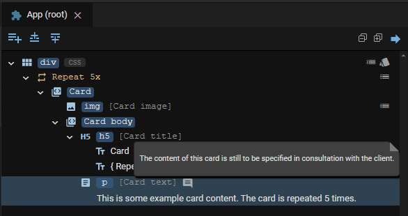
The new Repeat widget makes this process much easier: you design 1 element, put it in a Repeat widget and set how often you want this element to repeat. It is an alternative to the For Each widget, which always needs a data set to iterate over. Consider the following example:
Note that the content of the Repeat widget is repeated only in the full app. In the component preview, the repeated item is always shown once.
Adding comments to your template
Most designers and developers will agree that adding comments to a design offers several benefits: they help explain what specific sections of the markup do, help others quickly grasp the logic and functionality and simplify maintenance. As of this release, you can add comments to any element in your component template. A comment is displayed as a small popover that becomes visible when you move your mouse over it.

Note that all comments are also included in the generated source code, which is a valuable addition later in the project.
Creating collapsible regions
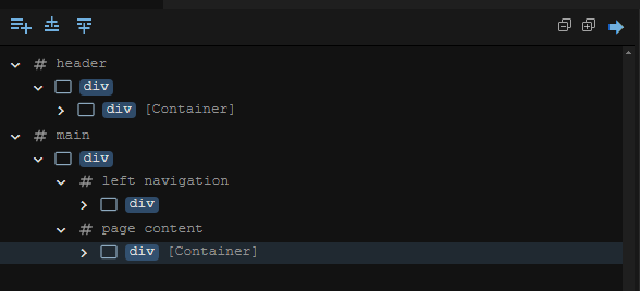
Another way to organize your template is to group elements that belong together. In a text-based HTML editor, you would do this by adding additional "container" HTML elements or comments. In JitBlox, you can easily add a collapsible Region widget (identifiable by a "#" and a self-chosen name). A lot easier, isn't it?

The Region widget can be added from the toolbox just like a regular widget. You'll find it in the Structural category.
Hiding elements without coding
Say you're working out a portion of your design but it's not exactly ready to show to your client. Or you want to try out different alternatives for a specific part of your app and be able to easily switch between them. That's what this feature was created for: to easily hide elements without losing them and without CSS tricks. Hiding an element only requires a single click, as you can see here:
Please note that this function also omits the hidden element from your app's generated source code.
Last but not least: convert to component
One of the goals of JitBlox is to make designing component-based applications easier. In theory, you design a component-based application top-down: you devise a component hierarchy and then start implementing the various components. In practice, this will often not be the case: you start with a simple design, and in this design parts arise that you think: if only I had set this up as separate, reusable component.
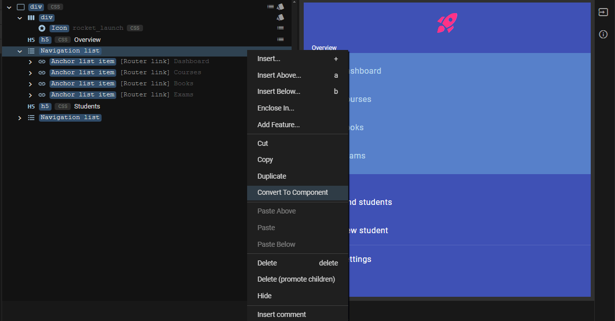
This is exactly what the Convert to Component feature is for: you select one or more (adjacent) elements in your template, choose Convert to Component from the context menu and provide a name for the new component. This will result in a new custom component being created, automatically replacing your selection with an instance of the new component.
You may now be wondering what happens if your selected elements have dependencies with component properties (in other words, are data-bound). After all, you want data-bindings to continue to work in the new component.
This is also taken care of: in the new component, input properties are automatically created where needed for bindings to work 😀. These inputs are automatically linked to the properties of the source component.
Try these new features for free!
Most of the new features in this release (except the Repeat widget) require a JitBlox Pro account. The good news is that you can still get free access to Pro features until the first milestone release by joining our free early access plan, with no strings attached and no credit card required!
Other recent changes
In addition to bug fixes and usability tweaks, the following changes are worth mentioning:
- The Fork function has been renamed to the more appropriate Save As.... This function was named after the similar fork function in source control systems, but the name caused confusion among our users.
- When binding to an item's index in a collection (0 for the first item, 1 for the second, etc), users can now add an offset to this index. This offset will typically be 1, allowing, for example, "List Item 1", "List Item 2" and so on to be displayed instead of starting with "List Item 0".
- Fix (type editor): the value of the "ID" property was not saved correctly. This property is important for generating
performant Angular
@forstatements. - Fix (Angular code generator): when data-binding the value of a HTML <option> element, the Angular
FormsModulewas not imported into the component.
Join the conversation
We encourage you to share your feedback with us, good or bad, by submitting issues or leaving a comment on this post. This will help us improve JitBlox and fine-tune our roadmap, so please let us know what you think.
Read next
Tailwind 4 support is here (and how to create a custom Tailwind theme without coding)!
Tailwind 4 support is here! Check out how we've made working with Tailwind and other CSS libraries even easier.
Supercharge your design workflow with Shoelace and Tailwind CSS in JitBlox
JitBlox now supports a new combination of two popular UI libraries to design your web apps with: Shoelace and Tailwind CSS. These two libraries, combined with the power of JitBlox's visual designer, provide an unparalleled real-time prototyping experience.
Announcing JitBlox 1.0: online visual prototyping of modern web apps
The interactive, online environment for accelerating the design and prototyping of modern component-based web applications is now out of beta!
Save the date: JitBlox 1.0 is set to launch soon!
After many hours of testing and ticking off the last feature on our 1.0 roadmap, JitBlox is getting out of the Beta stage at friday, september 13th.
Engage project stakeholders with your app designs using always-available previews
Introducing always-available previews: keep the preview of your apps online, making your prototypes available to other project members or clients at their convenience.
Invite your teammates to collaborate on your prototype
Starting today, you can invite your team mates to collaborate on your JitBlox project. Sharing projects has also become easier.

Comments powered by Talkyard.