Tailwind 4 support is here (and how to create a custom Tailwind theme without coding)!
A few weeks ago, the Tailwind team officially released Tailwind CSS v4.0, with a reimagined configuration and customization experience. A release that I was also looking forward to personally because of the improved utilities, but most of all because of the new CSS-first configuration 😀. Although JitBlox hides these technical details from you, we thought this release would be a great opportunity to make working with Tailwind (and with other CSS libraries) even easier. Let's see what this update entails for JitBlox users!
If you're not familiar with JitBlox, it's an online environment that accelerates the design and prototyping of modern component-based web applications. JitBlox lets you generate working prototypes interactively and without coding, giving you a jump-start on your next web project.
Overriding the default Tailwind theme
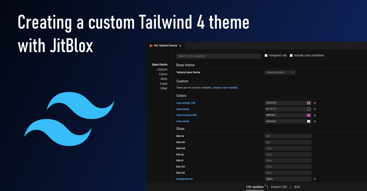
Like most CSS libraries, Tailwind uses design tokens: low-level design decisions for typography, colors, shading, breakpoints and more. In modern web projects, you store these design tokens in theme variables. When you create your custom Tailwind theme, the basis for your custom theme is the default theme, which is a collection of theme variables with predefined values.
In the JitBlox theme editor, discovering and overriding Tailwind theme variables works the same as for other CSS variables - even though Tailwind theme variables are more powerful (more on that below).

And, of course, all your changes are immediately visible in your app's Live Preview.
Creating custom design tokens
With this release, we have also added the ability to define new theme variables. You can then use these in your custom theme style sheet (with code completion!) or when styling your custom components. For example, you can add a new color to your project by defining a theme variable like --color-mint-500:
Note that any spaces in the name are automatically replaced with dashes and that we check the "This is a color variable" option so that JitBlox creates a color input for the variable.
In most UI libraries (like Shoelace and Bootstrap), theme variables are implemented as regular CSS variables. Tailwind variables, however, are even a bit more powerful*, because they influence which utility values exist in your project:
Because we prefixed the variable with color-, Tailwind allows us to simply use mint-500 for any color utility, for example for the Background color:

* Tailwind also generates regular CSS variables for your theme variables so you can reference your design tokens in arbitrary values or other styles.
Arbitrary values
Another Tailwind technique that, until now, could not be used in JitBlox was to set arbitrary values (this is a technique that other CSS libraries do not support). We have updated our utility editor so that you can now enter a custom value instead of one of the fixed options.

You may occasionally need to consult the Tailwind documentation for the correct notation. For most utilities, you should use square brackets, such as [200px] in the above example. However, to set the font size and line height of an element at the same time, for example, you should use a format such as text-sm/6 or text-lg/7.
Get started
Depending on your personal preference, we now offer two Tailwind options to choose from: one with and one without Shoelace web components:
- Shoelace with Tailwind using web components from Shoelace - check out this article for an introduction or create a new Shoelace with Tailwind app now.
- Shoelace only with no other dependencies - for when you don't need any other components. Create a new Tailwind-only project now.
If you already have an existing Tailwind project, you will be asked if you want to upgrade it to Tailwind 4 - this requires only one click. Note that a limited number of utilities will no longer work after the upgrade because they no longer exist in version 4.
As you have come to expect from JitBlox, you can download the full source code of your Tailwind with Angular project. After downloading, please make sure that you install dependencies using npm install --force instead of npm install, as indicated in the Tailwind Angular framework guide.
Other recent changes
A lot of work has also been done recently on our documentation. All sections have been revised and expanded. In addition, you will now find a three-part quick start tutorial, covering the most important aspects of building component-based apps with JitBlox.
We have also added some new hot keys to the component editor, such as the "q" key to quickly jump to the quick styling function for an element and the "e" key to quickly enclose an element in another, new element.
Read next
Supercharge your design workflow with Shoelace and Tailwind CSS in JitBlox
JitBlox now supports a new combination of two popular UI libraries to design your web apps with: Shoelace and Tailwind CSS. These two libraries, combined with the power of JitBlox's visual designer, provide an unparalleled real-time prototyping experience.
Announcing JitBlox 1.0: online visual prototyping of modern web apps
The interactive, online environment for accelerating the design and prototyping of modern component-based web applications is now out of beta!
Save the date: JitBlox 1.0 is set to launch soon!
After many hours of testing and ticking off the last feature on our 1.0 roadmap, JitBlox is getting out of the Beta stage at friday, september 13th.
Engage project stakeholders with your app designs using always-available previews
Introducing always-available previews: keep the preview of your apps online, making your prototypes available to other project members or clients at their convenience.
Create better web apps faster using advanced template editing features
Introducing an even better prototyping experience using advanced template editing features such as collapsible regions, comments and converting your selection to a new component.
Invite your teammates to collaborate on your prototype
Starting today, you can invite your team mates to collaborate on your JitBlox project. Sharing projects has also become easier.
Comments powered by Talkyard.