Quick styling, Bootstrap 5 final and Angular 13
Today I'm excited to announce JitBlox 0.27. This release includes many usability improvements and an update to our Bootstrap 5 foundation. If you're not familiar with JitBlox, it's an online environment that speeds up the design and prototyping of Angular applications. JitBlox lets you build working prototypes without coding, providing a jump-start for your next web project.
Final Bootstrap 5 support and Angular 13
Our Bootstrap 5 foundation makes use of high-quality widgets from the popular ng-bootstrap library, which recently released a new major version that has final Bootstrap 5 support: ng-bootstrap 12. This milestone means that we could also update our own Bootstrap 5 foundation, which has been in Beta until now.
We've also updated both our Material Design and Bootstrap foundations to Angular 13 (which is, by the way, also a prerequisite for using ng-bootstrap 12). Any newly created JitBlox project will automatically target Angular 13. For existing projects, you will need to confirm if you want to have it upgraded or not (or you can choose to upgrade at a later moment if you wish).
Quick Styling
We always try to encourage our users to make use of existing, tested CSS utilities (for example for spacing, sizing, or display), instead of building their custom styles. That is why we made some usability improvements that should make CSS utilities a bit easier to discover:
CSS utilities have moved
Previously, CSS utilities were part of the attributes section of the properties panel. This did not seem very intuitive, so we have moved them to the same place as the "regular" CSS classes section, which is now named Quick Styling.
Discovering utilities
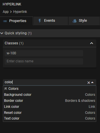
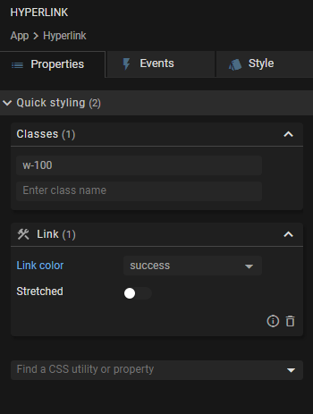
Quickly applying popular CSS utilities has become even easier thanks to a dedicated search function: just search for the style property that you want to apply, click a search result and a property editor for the utility will be added.


One small feature that was also missing in earlier JitBlox versions, was the ability to apply styling to the "root" of a custom component. For example, giving an entire component a particular background color was not possible without first adding your own container element for this purpose. This component-level styling can now be applied in the same way as you would style other template elements and can be accessed by choosing Style root from the template editor context menu.
Template editor improvements
We have also made some small but noticeable improvements to the template editor:
- The element tree got some layout and color improvements, making the template easier to read;
- The template editor now also shows CSS classes that are applied implicitly by styling an element with a utility property editor;
- The element tree now supports keyboard navigation and got some performance improvements.
What's next?
Meanwhile, we are working hard on ways to make building prototypes with JitBlox even faster.
Toolbox improvements
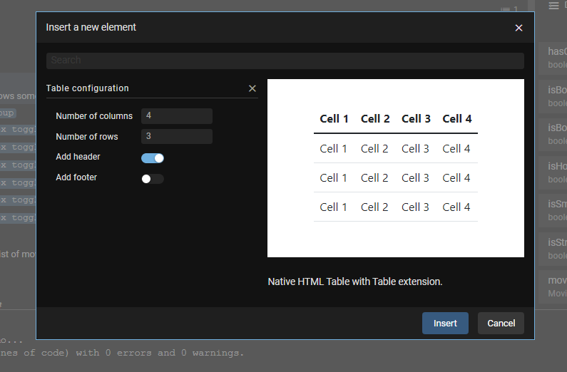
We are redesigning the toolbox. The current toolbox offers an overwhelming number of widgets that might still be hard to discover for starters. One of the new features will be a widget preview, allowing users to see what a widget looks like before adding it to a template. This feature will also work as a "wizard" for some widgets. A trivial example is a native HTML table: when adding a table, users can set the number of columns, a data source for the table's rows and some other options. Here's a sneak peek of what that would look like (note that this is a work in progress).

Also, the toolbox is moving to a new place. As you might have already guessed from the image above, we are planning to move the toolbox into a dialog that can be brought up with a single click or keyboard shortcut. This has a few advantages that are going to improve usability: the toolbox can be context-sensitive, meaning that the list of widgets can be limited to what makes sense for the element from which the toolbox was opened. Also, with the widget preview and wizard being added, the toolbox would take too much space at its current location. This is also related to another feature that we are working on and is high on our roadmap...
Component level preview
The component preview feature will give you a real-time preview of a (component-) template while you are building it. We are aiming to integrate this preview into the designer window, next to the template editor. This avoids the need to always open the full-screen application preview in another window when you are only focussing on a part of your app.
I'm looking forward to hearing your opinions and suggestions (you might also want to check out the JitBlox roadmap, which is updated regularly).
Read next
Tailwind 4 support is here (and how to create a custom Tailwind theme without coding)!
Tailwind 4 support is here! Check out how we've made working with Tailwind and other CSS libraries even easier.
Supercharge your design workflow with Shoelace and Tailwind CSS in JitBlox
JitBlox now supports a new combination of two popular UI libraries to design your web apps with: Shoelace and Tailwind CSS. These two libraries, combined with the power of JitBlox's visual designer, provide an unparalleled real-time prototyping experience.
Announcing JitBlox 1.0: online visual prototyping of modern web apps
The interactive, online environment for accelerating the design and prototyping of modern component-based web applications is now out of beta!
Save the date: JitBlox 1.0 is set to launch soon!
After many hours of testing and ticking off the last feature on our 1.0 roadmap, JitBlox is getting out of the Beta stage at friday, september 13th.
Engage project stakeholders with your app designs using always-available previews
Introducing always-available previews: keep the preview of your apps online, making your prototypes available to other project members or clients at their convenience.
Create better web apps faster using advanced template editing features
Introducing an even better prototyping experience using advanced template editing features such as collapsible regions, comments and converting your selection to a new component.

Comments powered by Talkyard.