Introducing a real-time preview of your custom components
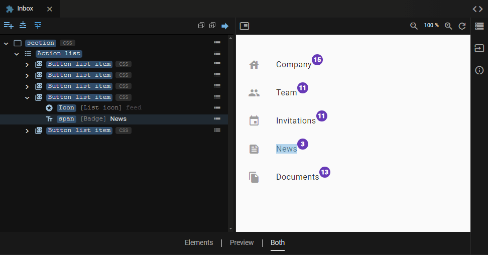
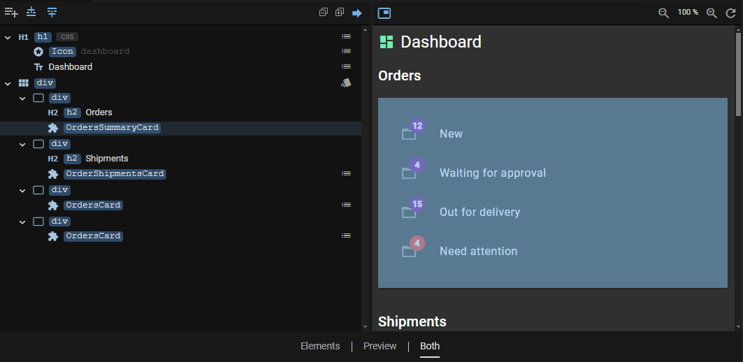
Today I'm excited to announce a nifty new feature in JitBlox: a real-time preview of every custom component in your project 😀. This feature will improve your prototyping experience: it makes it easier to design your custom components in isolation, meaning you no longer have to actually use a component in your app to see how it will look in a browser. The component designer now has a split view, with the familiar element tree on the left and the component preview on the right.
If you're not familiar with JitBlox, it's an online environment that accelerates the design and prototyping of modern component-based web applications. JitBlox lets you generate working prototypes interactively and without coding, giving you a jump-start on your next web project.
The difference from the full app preview
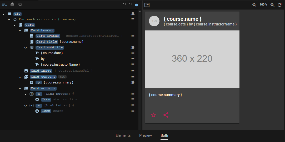
You can think of the component preview as a kind of mini-app: an app with only one component that is not contained by another component and has no data sources such as mock APIs. As a result, unlike the full preview, the component preview does not connect your markup to data (better known as data binding). Instead, you get placeholders in places where your component uses data bound content:
Selection highlighting
Each element (and any other item, such as a For Each loop) you select in the tree will also be highlighted in the preview, making it now a breeze to see where the elements are in the generated UI . This also works if you select multiple elements at once.
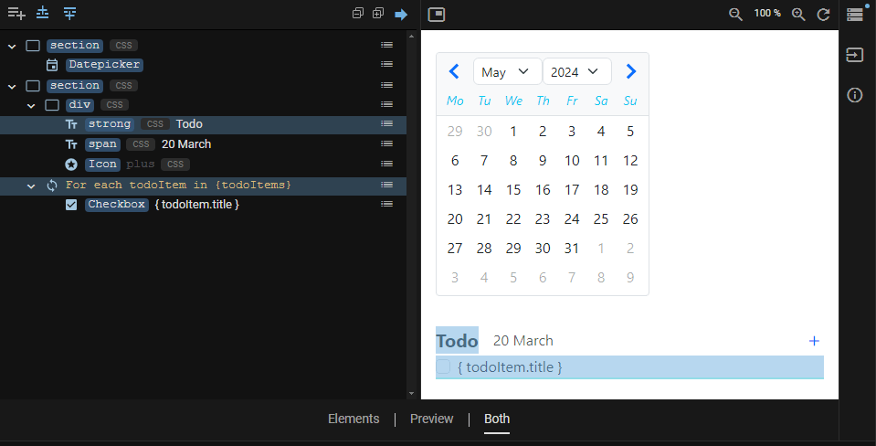
If you need to, you can turn this feature on and off by toggling the arrow icon at the top right of the Elements pane.
Showing nested components in the preview
In the places where your component contains an instance of another custom component, you'll see a placeholder with the component's name. We think this is the easiest way to keep track of the structure of your component markup:
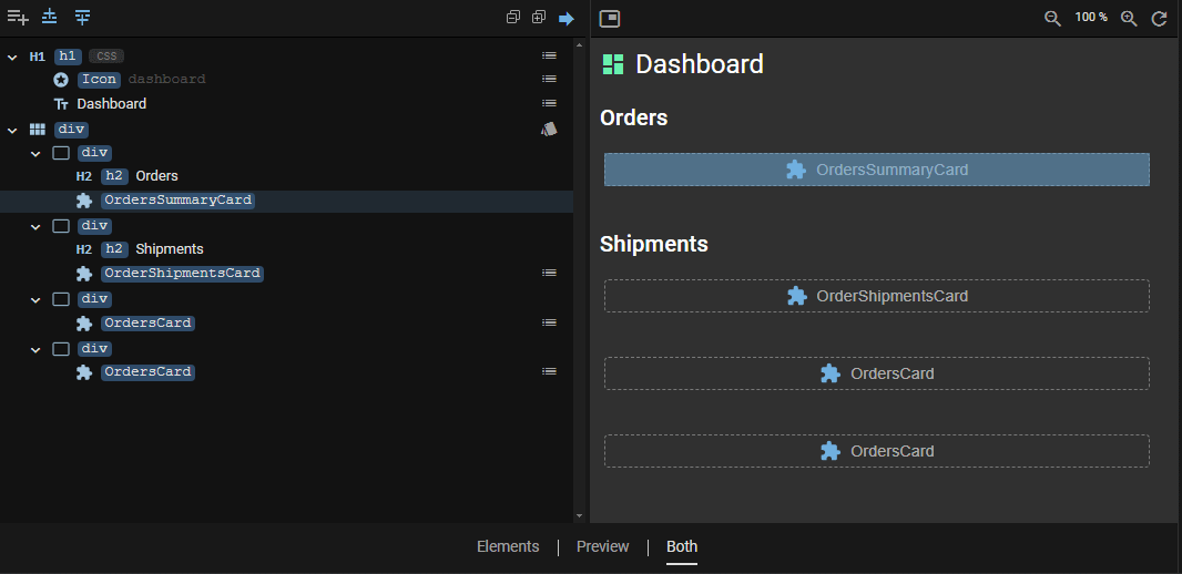
However, if you want to see the preview with nested components included, you can easily do so by toggling the "picture in picture" icon in the upper left corner of the preview pane.
Note that placeholders are also displayed for Router Outlets. If a Router Outlet has a default destination component, the preview of that component will be displayed just like other nested components.
Element tree changes
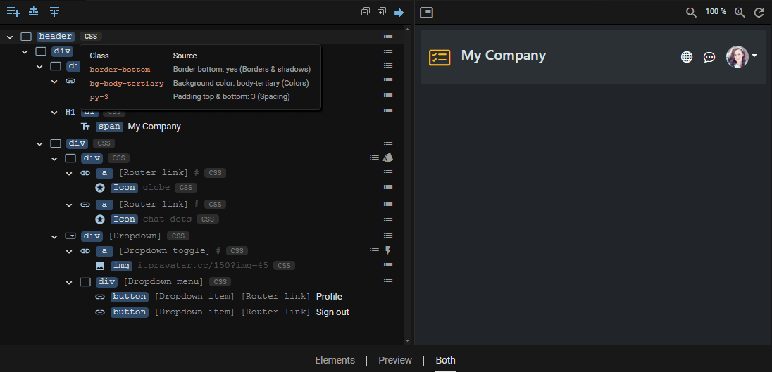
To save valuable screen real estate, we've updated the element tree so that it takes up less horizontal space but still shows the most essential information: The list of CSS classes of each element, which could take up a lot of space, has been replaced with a CSS badge and a handy popover that displays each class along with the reason why the class is being applied.
Other recent changes
In addition to bug fixes and usability tweaks, the following changes are worth mentioning:
- As you may have noticed, we recently introduced project templates, making it even easier to kick-start a new project.
- The element tree now allows you to collapse or expand all elements with a single click (using the plus and minus icons above the tree).
- Bootstrap projects can now easily use (and interactively configure) the Bootstrap Navbar, which was recently added to the toolbox.
Stay tuned for more exciting updates and features coming your way soon. Until then, happy prototyping!
We encourage you to share your feedback with us, good or bad, by submitting issues or leaving a comment on this post. This will help us improve JitBlox and fine-tune our roadmap, so please let us know what you think.
Read next
Tailwind 4 support is here (and how to create a custom Tailwind theme without coding)!
Tailwind 4 support is here! Check out how we've made working with Tailwind and other CSS libraries even easier.
Supercharge your design workflow with Shoelace and Tailwind CSS in JitBlox
JitBlox now supports a new combination of two popular UI libraries to design your web apps with: Shoelace and Tailwind CSS. These two libraries, combined with the power of JitBlox's visual designer, provide an unparalleled real-time prototyping experience.
Announcing JitBlox 1.0: online visual prototyping of modern web apps
The interactive, online environment for accelerating the design and prototyping of modern component-based web applications is now out of beta!
Save the date: JitBlox 1.0 is set to launch soon!
After many hours of testing and ticking off the last feature on our 1.0 roadmap, JitBlox is getting out of the Beta stage at friday, september 13th.
Engage project stakeholders with your app designs using always-available previews
Introducing always-available previews: keep the preview of your apps online, making your prototypes available to other project members or clients at their convenience.
Create better web apps faster using advanced template editing features
Introducing an even better prototyping experience using advanced template editing features such as collapsible regions, comments and converting your selection to a new component.

Comments powered by Talkyard.