Component templates
A template (also known as "view" in some web frameworks) is a reusable structure that defines the layout and presentation of a part of the UI. A template is essentially no different from a regular HTML document: it contains a tree of elements, and these elements have attributes and CSS classes. To display content dynamically using a template, web frameworks use additional instructions to link data and perform other logic.
JitBlox also lets you make your templates dynamic, but through a user-friendly UI. This allows you to focus on your design without having to worry about code. The template editor is a drag-and-drop editor in which you add native HTML elements, other components, logic and prebuilt UI blocks.
For the sake of simplicity, we use the term widgets for all the things (HTML elements, components and more, as you'll see below) that you can add to a template.
Inserting widgets
You add widgets using the toolbox. The toolbox lets you add both simple and complex components and configure them interactively before adding them to your template. You open the toolbox using the buttons above the template editor or via the context menu of the template editor. The following example shows adding a simple HTML heading.
Once you've added an element, you can easily set its styling and properties, but also configure dynamic behaviour by handling events such as a click event.
Tip: hit the `+` key to insert a new child, and hit the `a` or `b` key to insert above or below any currently active element.
Tip: To copy an existing element, press and hold the Ctrl-key (Windows) or Option key (MacOS) while you drop it.
Special widgets
In addition to native HTML elements and other components, the toolbox also includes a number of special widgets. You can find them in the structural category:
- For each: repeats its contents for each item in a collection of data. See data binding for more.
- If-condition: causes its content to appear only if a specified condition is true or false. See data binding for more.
- Repeat: repeats its contents a specified number of times. This can save you a lot of copy-paste work when you want to test how your design behaves with more content.
- Region: use a Region to group multiple elements together. Regions are not displayed by browsers but help organize your template.
About the template preview
The right part of the component editor shows a real-time preview of the component template. It's important to note that in some cases the preview of a template works slightly differently than the preview of the full app.
The template preview, unlike the full app review, does not apply any logic such as data-bindings or Repeat logic. Instead, if a text is data-bound, you will see the path to its data source instead of the actual data. The following example clearly demonstrates the difference between the two previews - see, for example, the { fruit.name } binding path in the template preview.
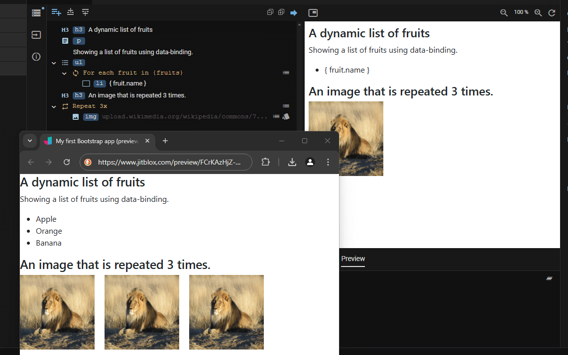
Why this difference? For a component like the example above to be fully functional, it must be part of a larger whole - the app. There, it is linked to data sources and other properties are set. In the template editor, however, you design a template in isolation: it has no notion of where it will be used and what data it should display (which can also vary from case to case).
For similar reasons, the template preview also has no working links or event handlers.
Extending elements
Sometimes, instead of adding a new element, it can be useful to extend an existing element with additional features. Common use cases for this are:
- Adding a tooltip to an element.
- Add in-app navigation support to a regular hyperlink (
<a>) by adding the Page Link extension. - Turn a
<div>element into a Bootstrap container.
Extending an element can be achieved by through the element details pane: this will open the toolbox with all the extensions that can be added to the current element:
Note that in many cases you won't need to extend an element in this way, because all extensions can also be inserted directly from the toolbox together with an element. The Page Link is a good example: when you select it in the toolbox, it is automatically inserted with a regular hyperlink element, or with another element of your choice (e.g. with a button).
Attached extensions can also be removed, if necessary. To do so, hover the mouse over the extension to see its summary and then click “remove.” Note that deleting an extension also deletes any related attributes.
Other operations
If you select an element in the template editor and open the context menu, you'll find - in addition to the standard actions - a number of operations that supercharge your template editing experience.
| Insert Above... / Insert Below... | Add new widgets immediately in the right place without an extra drag and drop action. Likewise, there are also Paste Above/Below... actions. |
| Enclose In... | Insert a new widget as the parent of the selected element, saving you an additional drag and drop action. This operation filters the contents of the toolbox to widgets that allow content. |
| Duplicate | Add a copy of the selected element in one click instead of using a copy/paste combo. Note that, if you want to create one or more exact copies of the same element, you can also enclose your selection in a Repeat widget instead. |
| Delete (promote children) | Remove an element you no longer need, but keep its content. Much faster than cut, paste and delete. |
| Change slot | Web components only: if the current element is inside a web component that has multiple slots, lets you select a new slot to assign the element to. Check out this blog post for an introduction on web components in JitBlox. |
| Edit Component | If the currently selected element is an instance of a custom component, opens that component in the component editor. |
| Convert To Component | Select one or more (adjacent) elements in your template, choose Convert to Component from the context menu and provide a name for the new component. This will result in a new custom component being created, automatically replacing your selection with an instance of the new component. |
| Clear Text | Clear the inner text of an element in one click. |
| Hide | Omit an element from your app without removing it and without having to use any CSS tricks. Useful for temporarily switching off elements and trying out different variations of your design. |
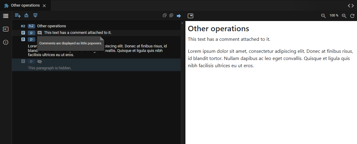
| Insert comment | Document your design by adding comments to the current element. |